
| 일 | 월 | 화 | 수 | 목 | 금 | 토 |
|---|---|---|---|---|---|---|
| 1 | ||||||
| 2 | 3 | 4 | 5 | 6 | 7 | 8 |
| 9 | 10 | 11 | 12 | 13 | 14 | 15 |
| 16 | 17 | 18 | 19 | 20 | 21 | 22 |
| 23 | 24 | 25 | 26 | 27 | 28 |
- svn
- git
- 문법
- Subversion
- 자바
- Checkout
- Android
- syntax
- TortoiseSVN
- 상속
- install
- 특징
- terms
- Class
- VCS
- error
- Android Studio
- SSL
- java
- IntelliJ
- 생성자
- Branch
- intellij 연동
- cherrypick
- IntelliJ IDEA Community
- gradle
- commit
- 캡슐화
- constructor
- sourcetree
- Today
- Total
Jay's Developer Note
[Android] Jetpack Compose - Layout 본문
Jetpack Compose - Layout
이번 게시글에서는 가장 기본적인 밑바탕이 되는 Layout에 대해 알아보겠다.
Compose의 Layout은 기존의 Layout과는 사뭇 다른 양상을 보인다. Cross Platform인 Flutter와 유사하다고 할 수 있다.
앞으로 RelativeLayout, LinearLayout, ConstraintLayout, 뭐 다른 Layout은 잊게 될 것이다.
무식하게 많던 Layout XML들아, 안녕
Compose의 Layout에도 여러 종류가 있다.
Grid, Scroll 등 있지만 이번 게시글에서는 가장 Basic한 Row, Column, Box 에 대해 서술하겠다.
간단하게 알아보면
Row : LinearLayout(android:orientation="horizontal")
Column : LinearLayout(android:orientation="vertical")
Box : FrameLayout
라고 생각할 수 있다.
Compose의 Layout들을 항상 content가 필요하다. Layout 단독으로는 빈 껍데기에 불과하다는 것이다.
이 content들은 <LinearLayout></LinearLayout> 태그 사이에 넣었던 Components와 동일하게 생각하면 될 것 같다.
Row
Row는 contents를 가로로 나열하는 Layout이다. LinearLayout의 horizontal orientation을 생각하면 쉽다.
외우기 힘들다면 가'Row'로 나열한다. 라고 생각해 보자.
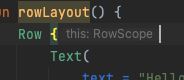
@Composable
fun rowLayout() {
  Row {
    Text(text = "Hello there")
  }
}
간단한 Text를 배치해 봤다.
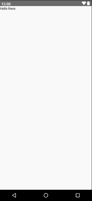
좌상단에 기본글씨로 Hello there가 나온 것을 볼 수 있다.
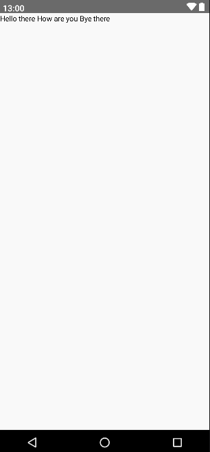
여기서 content를 더 추가하면 가로로 쭉 나열된다.
@Composable
fun rowLayout() {
  Row {
    Text(text = "Hello there")
    Text(text = " How are you ")
    Text(text = "Bye there")
  }
}
2번째 Text의 앞뒤에 공백을 줘야 여백을 줄 수 있다.
Text가 content로 올 땐 이렇게 휴리스틱으로 해도 뭐 어찌어찌 구현은 된다. 다만 예기치 못한 상황들이 많이 발생할 뿐...
그럼 다음과 같은 상황일 땐 어떻게 해야 할까?
Text가 아니라 Image를 넣고 싶어요!
Text를 위에서 좀 띄우고 싶은데요..
Text를 좀 꾸며보고 싶어요
이러한 조건이라면 절대 위의 방식으로는 불가능하다. 이런 경우에는 modifier를 사용해서 Text Compose에 제공해줘야만 한다.
modifier는 모든 Compose가 기본값 변수로 가지고 있다. 제공한다면 customized 된 것이고 아니라면 기본 값이 되는 것이다.
@Composable
fun rowLayout() {
  Row {
    Text(text = "Hello there")
    Text(
      text = "How are you",
      modifier = Modifier.padding(start = 4.dp, end = 4.dp)
    )
    Text(text = "Bye there")
  }
}
가운데 있는 Text에만 양쪽으로 Padding을 4dp 씩 주었다.

Text에 공백을 넣은 것과 동일한 결과가 나왔다.
하지만 Text가 달라진다면?
휴리스틱이라면 가운데 들어가는 녀석을 구분지어서 공백을 앞뒤로 추가해 주는 작업이 추가되어야 한다.
그렇기 때문에 modifier를 제공하는 것이다!
Modifier에 대해서는 다른 게시글에서 좀 더 자세하게 알아보자.
Compose Row의 CenterAlignment 역시 modifier를 사용할 수 있다.
Alignment는 다른 방식으로도 설정할 수 있다. 이 방식은 잠시 후에 설명해 보겠다.
이전 게시글의 '범위' 안에 내용을 보면 Row는 RowScope로 범위를 지정하고 있다.
후행 람다의 특성을 이용해 Row()의 맨 마지막인 content는 {} 안으로 빠져나왔다. 이 중괄호 안에서는 허용되는 전용 함수들이 있다.
그중 하나가 CenterVertically이다. CenterHorizontally를 사용하면 컴파일 단계에서 에러가 나게 된다.
@Composable
fun rowLayout() {
  Row {
    Text(
      text = "Hello there",
      modifier = Modifier.align(Alignment.CenterVertically)
    )
    Text(
      text = "How are you",
      modifier = Modifier
        .padding(start = 4.dp, end = 4.dp)
        .align(Alignment.CenterVertically)
    )
    Text(
      text = "Bye there",
      modifier = Modifier.align(Alignment.CenterVertically)
    )
  }
}
간단하게 각 content 안에 modifier를 제공해 주면 된다.
만약 content가 많다면 Row로 한 번 더 감싸서 해당 Row에 CenterVertically를 주면 간단하게 해결할 수 있다.
@Composable
fun rowLayout() {
  Row {
    Row(modifier = Modifier.align(Alignment.CenterVertically)) {
      Text(
        text = "Hello there"
      )
      Text(
        text = "How are you",
        modifier = Modifier.padding(start = 4.dp, end = 4.dp)
      )
      Text(
        text = "Bye there"
      )
    }
  }
}
결과는 동일하다. 하지만 다르게 나올 수도 있다. 그것은 Column에서 좀 더 설명해 보겠다.
Column
Column은 Row와 정확히 반대되는 개념이다. 모든 content들을 세로로 배치하는 Layout이다.
LinearLayout의 vertical orientation을 떠올리면 쉽다.
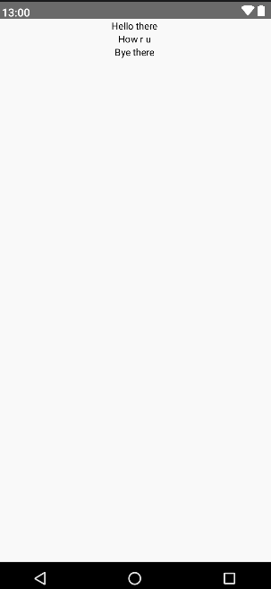
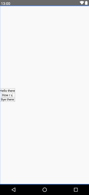
@Composable
fun colLayout() {
  Column {
    Text(text = "Hello there")
    Text(text = "How r u")
    Text(text = "Bye there")
  }
}
content가 하나일 경우는 Row와 동일하기 때문에 바로 3개의 content를 넣어봤다.
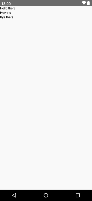
위처럼 세로로 3개가 배치된 것을 확인할 수 있다.
마찬가지로 modifier를 사용하면 content 간 padding, center align 전부 다 할 수 있다.
@Composable
fun colLayout() {
Column {
Column(modifier = Modifier.align(Alignment.CenterHorizontally)) {
Text(text = "Hello there")
Text(text = "How r u")
Text(text = "Bye there")
}
}
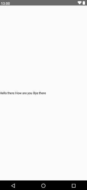
}Row와 같은 방식으로 간단하게 중앙정렬을 해보았다.
역시나 Column의 중괄호 안에는 ColumnScope 범위이기 때문에 CenterHorizontally를 사용해야만 한다.
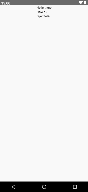
그런데 뭔가 이상하다..?
보통 알고 있던 가운데 정렬하고는 생김새가 다르게 보인다.
마치 앵커가 이상하게 잡혀있는 것처럼 보인다. 이는 가운데 정렬 예시로 든 소스코드의 Layout Level을 보면 이해할 수 있다.

Row에서처럼 Text들을 감싸고 있는 Column에다가 modifier를 제공했더니 해당 Column만 가운데 정렬이 되고 그 안에 있는 content들에는 적용이 안 됐다. 그래서 원래 원하던 가운데 정렬을 하기 위해서는 각 content에 modifier를 제공해야만 한다.
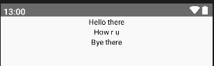
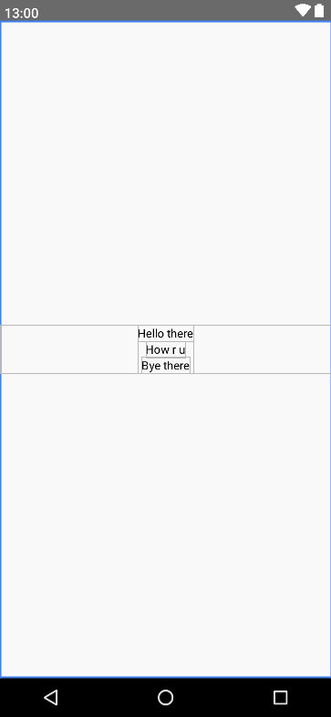
@Composable
fun colLayout() {
  Column {
    // CenterHorizontally를 사용하기 때문에 ColumnScope 안에서 선언해야 한다.
    val mod = Modifier.align(Alignment.CenterHorizontally)

    Text(text = "Hello there", modifier = mod)
    Text(text = "How r u", modifier = mod)
    Text(text = "Bye there", modifier = mod)
  }
}
기존에 감싸고 있던 column을 제거하고 각 Text에 modifier를 제공했다.
Center of Center
그렇다면 Center of Center는 어떻게 설정할 수 있을까? 기존 Layout의 gravity="center" 를 설정해 보자.
Row(Column)를 생성하고 CenterVertically(CenterHorizontally)를 주고
Column(Row)를 생성해서 CenterHorizontally(CenterVertically)를 주고
그 안에 Text를 넣으면 완전한 가운데 정렬이 되지 않을까?
@Composable
fun rcLayout() {
  Row {
    Column(
      modifier = Modifier.align(Alignment.CenterVertically)
    ) {
      Text(
        text = "Hello there",
        modifier = Modifier.align(Alignment.CenterHorizontally)
      )
      Text(
        text = "How r u",
        modifier = Modifier.align(Alignment.CenterHorizontally)
      )
      Text(
        text = "Bye there",
        modifier = Modifier.align(Alignment.CenterHorizontally)
      )
    }
  }
}
기대감을 안고 실행해 보면!?

Column은 잘 정렬됐고 Column안에 있는 Text들도 잘 정렬됐는데 왜 치우쳐 있지?
그 이유는 Column의 크기를 보면 알아챌 수 있다.
흡사 wrap_content처럼 감싸져 있는 것을 볼 수 있다.
그렇다면 width를 max로 늘려주면 가운데 정렬이 될 것이다. fillMaxWidth() 메서드를 사용하여 늘려보자!
@Composable
fun rcLayout() {
  Row {
    Column(
      modifier = Modifier
                   .align(Alignment.CenterVertically)
                   .fillMaxWidth()
    ) {
      Text(
        text = "Hello there",
        modifier = Modifier.align(Alignment.CenterHorizontally)
      )
      Text(
        text = "How r u",
        modifier = Modifier.align(Alignment.CenterHorizontally)
      )
      Text(
        text = "Bye there",
        modifier = Modifier.align(Alignment.CenterHorizontally)
      )
    }
  }
}
야무지게 Center of Center 정렬이 되었다.
그렇지만..!
가운데 정렬을 하기 위해 Column을 하나 추가하고 각 Text에다가 Modifier를 제공하는 것은 너무나도 귀찮고 너무나도 비효율적이다.
그렇다면 이것 말고는 다른 방법은 없는 것일까? 아까 위에서 잠시 언급했던 다른 방법을 써보겠다.
Parameter로 Layout에 제공하는 방법!
@Composable
fun cocLayout() {
  Column(
    verticalArrangement = Arrangement.Center,
    horizontalAlignment = Alignment.CenterHorizontally
  ) {
    Text(text = "Hello there")
    Text(text = "How r u")
    Text(text = "Bye there")
  }
}
Column Layout에
verticalArrangement = Arrangement.Center
horizontalAlignment = Alignment.CenterHorizontally
값을 제공해 주면 된다.
해당 값들은 기본값 변수로 각각
verticalArrangement: Arrangement.Vertical = Arrangement.Top
horizontalAlignment: Alignment.Horizontal = Alignment.Start
이렇게 설정되어 있다. 그래서 아무 설정이 없으면 좌상단부터 그려지는 것이다.
Arrangement는 Layout의 자식들의 방향을 설정해 주는 역할을 한다. 끝부터 배치 시작할 것인지 균등하게 배치할 것인지 등등이다.
이 또한 Column, Row가 다르기 때문에 다른 게시글에서 좀 더 다뤄보겠다.
Column에서는 Vertical로만 방향을 줄 수 있고, Row는 Horizontal로만 방향을 줄 수 있다.
Alignment는 기존 언급했던 것과 마찬가지로 Column은 CenterHorizontally, Row는 CenterVertically로만 쓸 수 있다.
Row에서는 제공하는 변수가 다르다.
horizontalArrangement = Arrangement.Center
verticalAlignment = Alignment.CenterVertically
제공하는 Arrangement와 Alignment가 서로 상반됨을 유의하자.
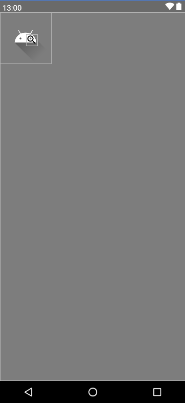
Box
Box는 상자다. 그 말은 곧 '적재'를 할 수 있다는 의미라고 할 수 있다. 기존의 FrameLayout과 비슷하다고 보면 좋을 것 같다.
자유롭게 배치를 할 수 있다는 것이 가장 큰 장점이다. 하지만 자유도가 올라간 만큼 실수가 잦아질 수도 있고, 내가 원하는 대로 배치하기 힘들 수도 있다. 그럼에도 '자유도' 이것 하나만으로도 쓸 이유가 충분하다.
@Composable
fun boxLayout() {
  Box(modifier = Modifier.background(color = Color.Gray)) {
    Image(
      painter = painterResource(id = R.drawable.ic_launcher_foreground),
      contentDescription = "Android Image"
    )
    Icon(
      Icons.Filled.Search,
      contentDescription = "Icon",
      modifier = Modifier.padding(vertical = 46.dp, horizontal = 55.dp)
    )
  }
}
간단하게 안드로이드한테 모노클을 착용시켜 봤다 ㅋㅋ..
마치며
이번 게시글에서는 Row, Column, Box Layout에 대해 알아보았다.
쓰다 보니 이것저것 추가되어 길어져버렸다..
마지막으로 아래의 Layout을 어떻게 짜면 될지 생각해 보며 마치도록 하겠다.
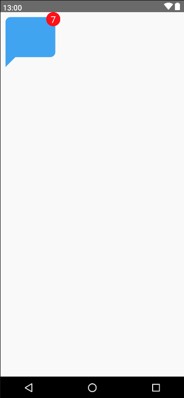
알림 배지를 적용한 화면을 구상해 보자!
정답은 더보기에!
@Composable
fun bubbleChatLayout() {
    Row {
        Box {
            Image(
                painter = painterResource(id = R.drawable.baseline_chat_bubble_24),
                contentDescription = "Chat Bubble"
            )
            Box(
                modifier = Modifier
                    .background(color = Color.Red, shape = CircleShape)
                    .width(30.dp)
                    .height(30.dp)
                    .align(Alignment.TopEnd)
            ) {
                Text(
                    text = "7",
                    textAlign = TextAlign.Center,
                    fontSize = 20.sp,
                    color = Color.White,
                    modifier = Modifier.align(Alignment.Center)
                )
            }
        }
    }
}'Android' 카테고리의 다른 글
| [Android] Jetpack Compose에 쓰인 Kotlin 특징 - 2 (2) | 2023.12.01 |
|---|---|
| [Android] Jetpack Compose에 쓰인 Kotlin 특징 - 1 (2) | 2023.11.27 |
| [Android] Jetpack Compose 장점 (0) | 2023.11.26 |
| [Android] AWS S3 Pre-Signed URL 로 Streaming 하기(Util 소스 코드 有) (0) | 2022.10.31 |
| [Android] AWS S3 Download 하기(Util 소스 코드 有) (2) | 2022.10.27 |


